Insight
Using Symbols in Web Design
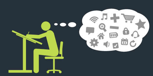
Symbols are everywhere. They’re among the first things we learn and continue to play an important part of our daily lives. They tell us when to stop or go, whether something is safe or dangerous, and even tell us stories. Their simple visual nature makes them possibly the most effective way to communicate an idea, especially since they are able to transcend one of the most common communication barriers: language.
Naturally, our dependence on symbols has migrated to the Internet. You might even say that they are even more important online, since this is an experience that is almost entirely visual. Here, symbols are what tell us where to go, what to do and how to do it. This is why it’s so important to understand the purpose of symbols and why we must get them right in order to create the best experiences possible.
The Art of Simplification
Symbols are all about simple communication. A good symbol will capture a person’s attention and communicate an idea in the simplest way possible. To better understand this concept, let’s take a look at one of the masters of simplification: Apple.
Part of Apple’s massive success is its ability to create products that are simple & intuitive to use. At the heart of it all is the drive to remove any unnecessary components: The iPhone is a giant screen with a few buttons; The magic mouse is one giant button with no right click button or scroll wheel; The magic trackpad is one giant button and relies on hand gestures.
In its Apple Univeristy internal training program, Apple teaches employees about Picasso’s “The Bull” drawings. Picasso was trying to draw a bull in the simplest way possible. In doing so, he went through many iterations to go from a highly detailed illustration to one that had the fewest elements as possible.

It took several attempts to get there, but eventually Picasso was able to effectively communicate that you are looking at a bull by using just a few lines on the page.
Everyday Web Symbols
You might not realize it, but the mere fact that you were able to find this article in the first place required you to use a handful of symbols. Let’s take a look at a typical journey you might have gone on to discover this article on the Hover blog.

To do anything at all, you need a way to interact with your device. If you are using a computer, you would use this arrow as an extension of yourself to click an item on your screen.

Next, you would have opened up an Internet browser. This would have required clicking on the symbol for the browser of your choice.

If you performed a search for symbols & web design, this magnifying glass indicated that clicking it would search the Internet for your query.

If using a computer you would have moused over this article’s headline, at which point the arrow symbol would have switched to this pointer symbol. This communicates that you can now select the link and load the article.
And that’s only the beginning! Think of all the tasks you might need to do online – going backwards or forwards, refreshing the page, pressing play, going fullscreen, liking, retweeting, adjusting the volume – and then consider how these actions are performed. What you’ll find is that most of them are indicated not by words but by lines, boxes, triangles, arrows & other symbols!
Incorporating Symbols Into Your Designs
For web designers, it’s inevitable that symbols will end up in your designs in one way or another. Here are a few important points to remember when considering which symbols to use & how to implement them.
Remember Your Audience
While symbols can be easier to understand, that does not mean that they will always carry the same meaning. One of the strongest examples of this is the swastika, which was once used by many different cultures to represent sun, life, power, strength & good luck until the Nazis infamously used it and forever changed its meaning.
It’s obvious that you shouldn’t use a swastika as the symbol for logging into an account, but don’t forget the important lesson here: choose a symbol that your audience will understand. Consider the following symbol:

A guitar player would recognize that this is an effects pedal, so it would be a good choice for the effects pedals section of a guitar store’s website. This symbol would be lost on a coffee accessories website, since it has no relation to coffee whatsoever. Again, this is a pretty obvious point, but don’t overlook the important step of considering your audience. Once you’ve decided which symbols you’d like to use, try asking potential visitors to your site what they think the symbols represent. You might be surprised which seemingly perfect symbols your audience finds confusing.
Use Symbols for Frequent Actions
Think of what visitors to your design will be doing once they get there. Chances are that the structure of your design will be based on this already. Symbols can be an efficient way to enable people to perform frequent actions without spending time reading options. For instance, here’s a screenshot of LinkedIn’s navigation toolbar:

Here we’re presented with a number of different things that we can do. While the majority of the options are in text, note the options on the right:
![]()
These are in all likelihood the 4 most frequent items a user will want to access: check messages, view notifications, see connection requests, and adjust account settings. If these options were written out as well then LinkedIn would risk cluttering the options with too much text. Since we are more likely to check these sections on each visit, LinkedIn uses this as an opportunity to declutter the toolbar by using symbols.
Where to Find Symbols
Don’t be fooled by the simplicity found in symbols; they can be painfully difficult to create. Just like Picasso’s Bull has shown us, it can take a lot of thinking and many iterations to boil a concept down to its most basic form. Luckily, there are others out there have done all of the hard work for you! Plus, you can find many of them for free (if you give the designers credit) or purchase them for as little as $1.
If you’re looking to grab some symbols, here are some sites that I’d recommend:
Flat Symbols
Flat symbols are the simplest imagery that you will find. They are typically 2-dimensional and all black (though you can change the colour, of course). These are the symbols that you will find the most within websites & apps.
TheNounProject – A great community-based library of symbols (I’ve even submitted a few!) that you can download for free (with attribution) or pay for unrestricted use.
Glyphicons – A collection of premium symbols starting with a limited selection of symbols for free (with attribution), or a one-time fee for unrestricted access to the entire library.
FlatIcon – A completely free (with attribution) collection of symbols that even has extensions for Adobe PhotoShop, Illustrator & AfterEffects that lets you search for symbols right from your workspace.
Detailed Symbols
If you’d like to incorporate icons into your design but would like a little more detail, these are some great options to check out. For web design, these might not be as effective as flat symbols within a site or app’s architecture but will be great for the content sections.
Find Icons – A completely free collection of symbols.
IconArchive – A free collection that specifies whether a symbol needs attribution, is completely free for use, can be used commercially, or even let you donate money directly to the artist.
DryIcons – A collection of original premium icons available for free (with attribution) or for purchase.
The Takeaway
At the end of the day it’s all about effective communication, so be sure to use your best judgement. If it really feels like text, video or a detailed illustration are the best way to communicate your idea then by all means go for it. I would just urge you to really consider all options in order to make sure that your choice is truly the best one.
As one of the earliest forms of communication (i.e. cave drawings), symbols have stood the test of time as one of the best ways to communicate ideas to each other. When used properly, they can enrich your design by making them easier to understand and use.
Know of any web designs that have used symbols really well? Or how about any that have been mind-numbingly confusing? Be sure to share them in the comments below!
*Architect designed by Augusto Zamperlini from the Noun Project
*Icons in header image by Room Design